Fashion is very good at creating stars. The designers, photographers and stylists we all admire have generally had their fair share of magazine front pages and shop windows, ensuring their deeds don’t go unnoticed. The industry is built on image and exposure, in one never-ending love affair. But just as much as we like having visible stars around, the industry is propped up by unsung heroes – the people who make shit happen behind the scenes. These people oil the machinery, arrange the furniture and connect the dots between all the prominent forces in the industry. They are buyers, sellers, editors and agents, and fashion wouldn’t survive without them.
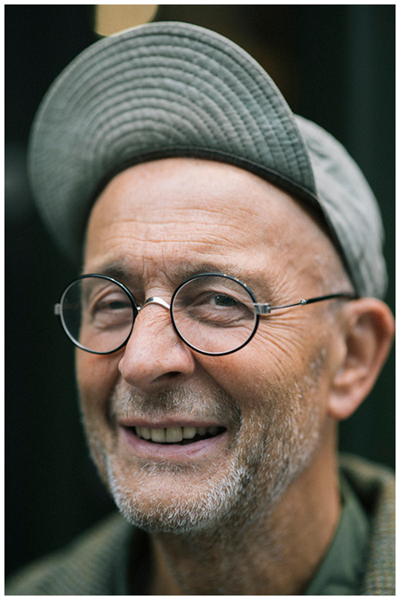
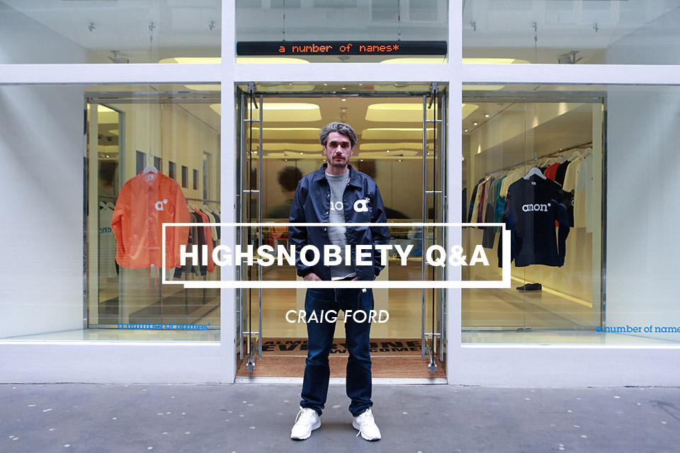
Take Craig Ford, for example. As founder and head of London-based sales and PR agency a number of names* (anon*) he’s introduced Europe and the UK to brands like BAPE, Billionaire Boys Club, ICECREAM and CAV EMPT. Still, most customers won’t know him from Adam. That’s Ford’s strength, and has been since he first got involved with fashion 20 odd years ago.
Originally from Glasgow, Scotland, Ford has worked for legendary brands like Duffer of St George and 6876. By launching the BAPE franchise in London, Ford helped change the capital’s retail landscape, and when introducing niche Japanese brands to a Western audience, he helped translate the pages of titles like Boon and Men’s Non-No into real life. In the same way Japanese designers keep on referencing British and American culture, we have long looked to Japan for the most creative and forward-facing fashion – both high-end as well as streetwear.
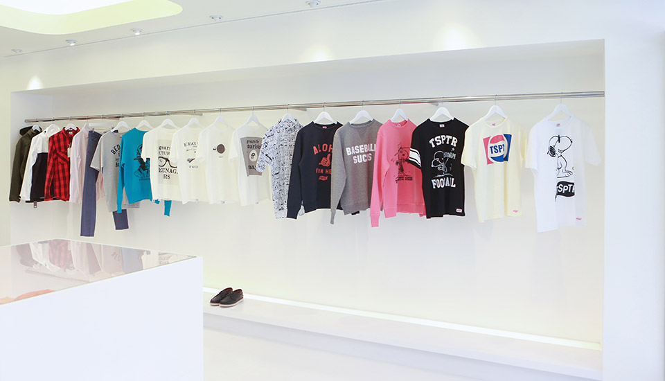
Through his agency, and his own personal involvement with brands, Ford has built a solid reputation as not only a talent spotter but also an influential tastemaker. As he says himself, “it’s not just about PRing and selling these brands, but helping to shape and form them.” This year he’s taking that skill a step further by opening up a second anon* store selling both his own in-house line and pieces from select anon* friends.
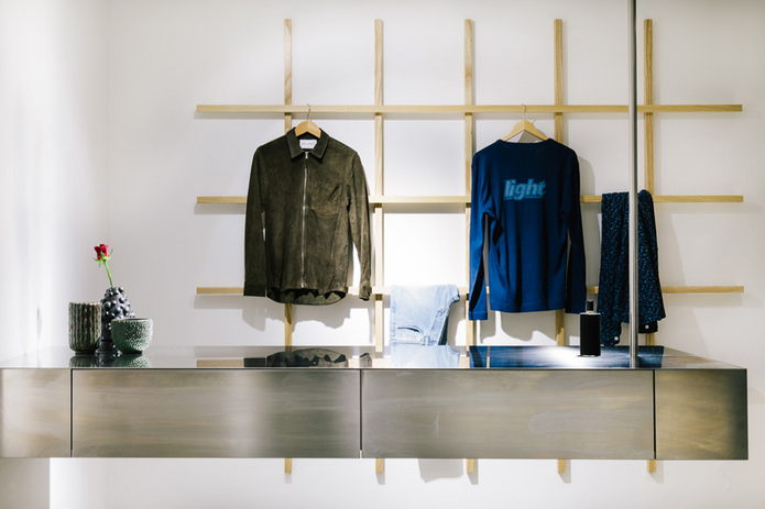
The London store is housed in the old BAPE store on Upper James Street. Isn’t it beautiful when fashion, as well as life, comes full circle…

What is anon*… how would you explain it to an outsider?
anon* is a bit of an enigma. I started my company solely to distribute Billionaire Boys Club, which I had already successfully launched in the EU. It was a great opportunity. One of my business mentors, Toby Feltwell fromCAV EMPT, pointed out pretty quickly any successful distribution company needs to have a few brands. If one goes down, one goes up. When I started the company I knew I was creating a brand essentially. I knew it had to be strong from the name to the identity, image and communication. I thought long and hard about the name before I finally reached my decision.
To an outsider, I’m in the rag trade/garment/schmatta business, selling clothes, but I’m also selecting, editing, designing, marketing and promoting them. My friend Scott King drew the analogy between my distribution company and an art gallery representing artists. We work closely with many of our brands and design EU specific and sometimes global product for Billionaire Boys Club, ICECREAM, Gourmet and Ebbets Field Flannels. I have also just launched our own label. Unlike my other brands, they won’t be available wholesale; just sold via our shop and website.
When and why did you start it?
anon* started in 2008. My journey through fashion started initially buying old stock from the Chevignon sale shop in Paris and selling it on to my mates in Glasgow. Then I carried on as a Saturday boy at Ich Ni San Glasgow in 1989, via the Scottish College of Textile, Duffer of St George, 6876, Gimme5, BAPE and on to the present day. Taking in consultancy roles for New Balance, Dr Martens, adidas, Harley Davidson, Pretty Green, Henry Lloyd, Caterpillar and others along the way.
What was London’s own fashion scene like back then?
When I moved to London I was pretty excited. First week I arrived, I went toDazed & Confused’s second birthday party at a strip club, drank free drinks for the first time and met everyone from Kate Moss and Fraser Moss (then Professor Head, now YMC). I was interning at Duffer, although I wanted to intern for either Massimo Osti or 6876. I was a bit over Duffer at the time, but I got sucked in. The shop had just opened in Covent Garden, so it was really Duffer 2.0.
I was working in the shop on Saturdays but buying sneakers for Eddie and Marco’s offshoot company, Trendsetter Ltd, during the week, among many other things. The Duffer shop at the time really was the London fashion scene. We were selling loads of Nikes, and this was before Nike were selling to fashion stores. I actually once drove to Runners Needs in Camden in the company Merc, bought their complete allocation of Footscapes, drove them to Covent Garden, and then priced them up at twice what we paid!
What intrigued you about Japan?
I loved BAPE both before and while I was at Duffer. I initially saw it via the Beastie Boys, and I went out with Fats from Gimme 5’s girlfriend’s sister so I got hooked up through her. I knew Good Enough from Dr Jives in Glasgow. It was a popular label with the cognoscenti at the Sub Club [notorious Glasgow nightclub]. I saw them as a totally (post) modern move from the lineage of Chevignon, Stussy and Duffer. One day Eddie from Duffer sent me to the Japan Centre to buy the latest copy of Boon magazine the day it was released. My mind was blown. You have to remember this is pre-Internet. I knew immediately I had to get there.
When was the first time you went there?
I went there that year. Barnsley worked out you could get cheap flights in July. It was 180 yen to the pound, so not bad for us. To me that’s the perfect rate for us and them. I took all the cash I had out of the bank, went out there for ten days; Kyoto, Osaka, Tokyo, and spent all my money.
Marco and Eddie gave me some cash to bring back some stock for the shop. Levi’s were reissuing Big Es made in Japan, only in Japan. We were the only store selling them outside Japan. I had to come back with a suitcase full. This is before a global market existed for the vast majority of brands.
How did you get in contact with the likes of NIGO?
I met NIGO through Michael Koppelman from Gimme 5. When Michael had the opportunity to open the BAPE Store, he contacted me to set it up and oversee the operation. I met him in 2003, post-James Lavelle and pre-Pharrell; It was an interesting era for BAPE. NIGO had just had an iced-out belt buckle made by Jacob, and it was just before he did the patent Bapestas. It was through NIGO I met people like Tetsu from WTAPS and Poggy. I had known Toby for years through a mutual friend in London. I met Pharrell from coming in to the store in London.
How did they view you? Were you as “exotic” to them as they were to you, considering how obsessed Japan is with British and American culture?
They were selling Western style back to us, but we loved it.
What was the first brand you took on?
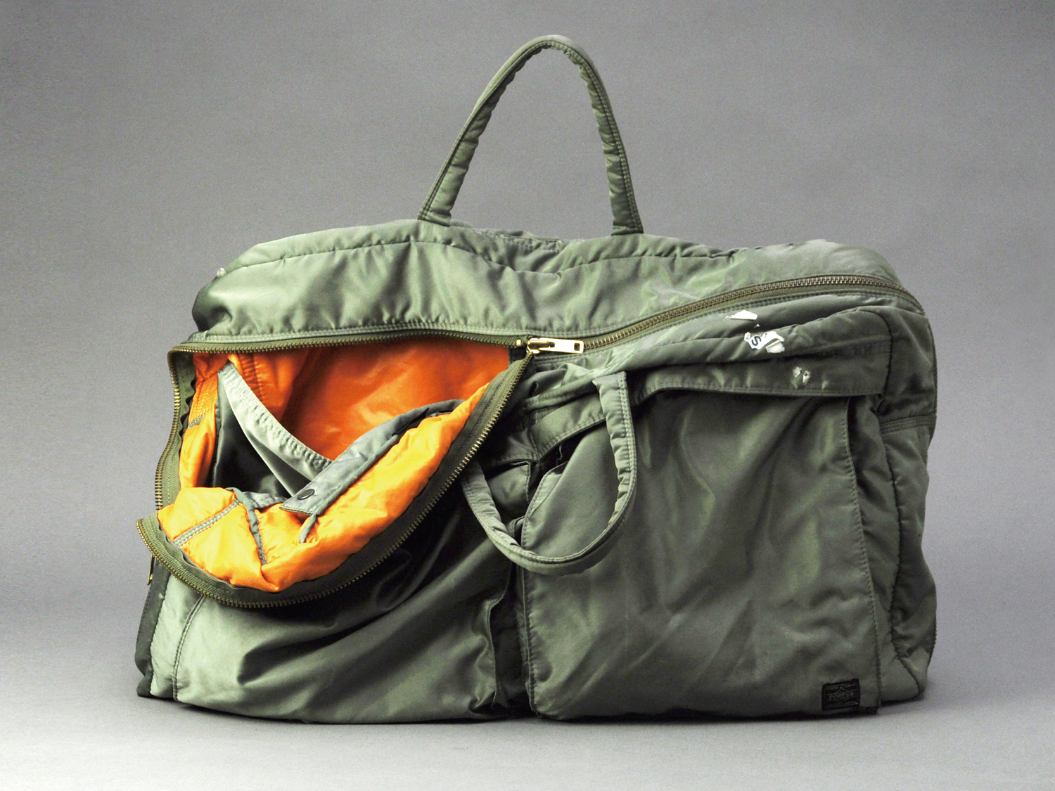
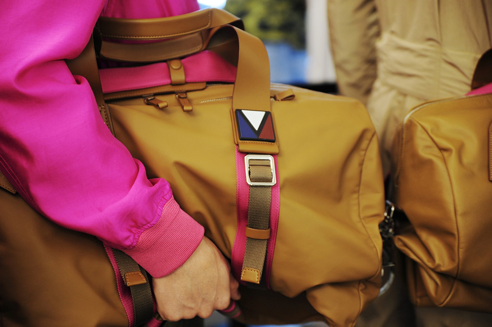
The first brand I launched was Product 250, which was another sideline I had whilst working at Duffer. I started my company to run the London BAPE franchise, and to distribute Billionaire Boys Club and ICECREAM. The brands I worked with were Gourmet, Ambush, aNYthing, and the relaunch of Dr Martens.
What was the initial reaction over here to brands like BAPE?
BAPE had an amazing underground following in London. Very Ape was available at Slam City and Fly, but people used to get items sent from Japan, and resell them. Johnny Fibber used to sell things under the counter at Duffer.
What new Japanese brands excite you today?
What is it, do you think, that makes the Japanese so great at menswear – everything from BAPE to Comme and Yohji?
I don’t like to use cliches, but attention to detail is part of it. It’s also presentation. BAPE presented very simple ideas in a very sophisticated way. That was one of the first things I noticed when I went to Japan 20 years ago: the presentation. All the shops were immaculate, thought-out, with goods presented very lovingly. Products were fetishized. The way they presented what we would think as everyday brands, from the U.S., UK or Italy, would make you reevaluate them.
What’s next for anon*?
I’ve had a busy year so far with the opening of the new store, developing the range, and opening the Billionaire Boys Club EU flagship store. We’ll be developing some special products for the store; we have a shoe coming out made by a company I really respect. There’s also some traditional UK made items and we’re planning a party for somebody with a major U.S. artist performing. We are also doing some consultancy for a few brands on design, PR, marketing & sales.
http://www.highsnobiety.com/2015/06/09/craig-ford-interview/